Thursday, 12 January 2017

Evaluation — OUGD601


Evaluation

Context of practice has always been major learning curve for me, especially after being required to resubmit my COP1 module, then by improving my understanding of what it takes to write a successful essay during level 5, du to this fact, there was never a time when I felt like COP3 was never going to be a true test my academic writing ability. The scale of the research and of solidarity of synthesis between the writing element and practical element needed to be much more harmonic than previous years.
            Due to the substantial importance of the research — taking the time out to visit various exhibitions and buildings — as well as gaining another perspective in the form of an interview, which I had never actually undertaken until this unit, provided me with a much more solid basis on to which I could make various points to aid my critical investigation. This never dawned on me that this aspect of the work could have such a huge impact on the practical outcome. The research alone was enough to provide me with the necessary inspiration to create the concrete typeface and also making the most of tutorials enabled the realisation that a publication would synthesise the essay perfectly. This is the first time the practical outcome has come naturally due to the research undertaken, and it must be said that it is both stimulating and fulfilling that the outcomes produced were fully informed by the writing, rather than requiring additional secondary research through the use of the blog.
            The satisfaction that I received from successfully answering the question at hand; ‘Is the Modernist Ideology still relevant today?’, was enough to make me want to continue my investigation into another project for Extended Practice, and also, this is the first time I can say I would want to continue writing to uncover more and more about the area’s I’ve became so passionate about.
            Learning countless techniques and processes that had never actually been part of my design development as it reached far out of my typical comfort zone, and has also helped me break out of the graphic design bubble that I have put myself in throughout the years. This also meant that time management had to be like clockwork to ensure that the sheer amount of writing and practical that I had undertaken was completed in time, hence the Gantt chart published on my blog earlier in the project.
            If I were to execute this project again, I would spend more time reading about the subjects that I am less informed in, as the architectural side of the essay was quite a hurdle to overcome, constantly having to refer back to the theoretical side is not like graphic design that I have been studying for years and am much more proficient at. The practical aspect went very much to plan, the constant thinking and contemplating how to overcome issues like transport and learning curves to produce something physical, that can be touched, enabling me to get out of the routine of thinking that digital mock-ups are sufficient when graphic design is concerned.
            To sum up, this project has been a rewarding and satisfying project, and I can happily say I’d like to continue one with this subject if the opportunity ever presented itself.

Synthesis — OUGD601

Practical Synthesis

Visually representing the idea’s and theories used by Modernist graphic designers outlined in the dissertation, and most imperatively of all, architects, was possible by combining typography, in the form of Thomas More’s Utopian Alphabet, and finally concrete, the most abundant material in Brutalism — a popular subgenre of Modernist architecture from the 1940’s to 1980’s. This idea is also inspired by the 500th anniversary of Thomas More’s Utopia, in conjunction with the ‘Utopia 2016’ exhibition at Summerset House, linking the ideologies used by Modernist graphic design and architecture, that Modernism was essentially a search for a utopian design solution to any given issue.
            Brutalism was the main focus due to its recent surge in popularity, thanks to Historic England recognising and listing a large amount of the most pioneering designs of the mid-to-late 20th century, executed in Brutalist style. The main point here being not that these buildings weren’t necessarily considered pioneering at the time of erection, it is largely because they are now being considered as a figure of the past, as national ‘heritage’, and thus are being preserved rather than demolished. Taking this into consideration, it is this turning point that Modernism has recently encountered — it’s becoming more of a figure of the past — thought of only as nostalgia rather than having genuine relevancy in today’s society.
            Taking inspiration from Le Corbusier’s Unité d’Habitation in Berlin, to which was photographed on a visit, the letters were executed to represent that of the materials Le Corbusier used so predominantly, ‘Béton Brut’, translating to ‘Raw Concrete’ in English;

‘In the hands of Le Corbusier the amorphous material of crude concrete—béton brut—assumed the features of natural rock. He did not smooth away the marks and hazards of the form work and the defects of bad craftsmanship.’ (Le Corbusier, 1971, p. 84)

It is this that closely relates to Louis Sullivan’s influential 1896 essay, where the term ‘form (ever) follows function’ was coined, it is this ideology that Corbusier followed within this own designs, hence there being no ephemeral features within his buildings, the only necessities he saw appropriate was how the building was intended to function, not letting its function be compromised by unnecessary flares. Therefore, his visions of utopia were executed through this straightforward manor, cue his famous phrase: “The house is a machine for living in.”
            Lastly, the concrete alphabet letters are accompanied by an informative book that fully explains the synthesis explored thorough the dissertation and concrete letters, and thus featuring some of the most important pieces of research, further explaining the synthesis of ideals within the Modernist design industry. Executed in a Modernist style, which could be considered as Swiss or International style, similar to that of the work of Experimental Jetset, but also representing how Modernist graphic design is utilised today, harbouring many influences from the Postmodern movement;

‘But now, as the cycles of change continue, Modernism may be re-emerging somewhat, a renewed minimalism that is calming down the visual outburst of activity of the past fifteen years.’ (McCoy, 1994, p. 50)

this providing much more creative freedom whilst abiding by many of the Modernist tendencies like a strong use of the grid system and sans serif typefaces.

Tuesday, 10 January 2017

Publication — Binding — OUGD601

The final touch to the practical outcome is probably the most time consuming, the notorious coptic bind.

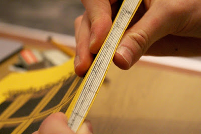
Using a bone folder to get the tightest crease possible down the spine:

Measuring 12 evenly spaced lines to make holes into each signature, a total of 144 holes are to be made using a needle:


Time to begin stitching, learning from past experience thicker thread leads to a clunkier, looser finish, so opting for a thin thread, small needle and doubling up the thread meant that a cleaner, much more durable finish could be achieved:


6 hours of sewing later and it was finally complete:


Cutting down after binding ensures a clean edge, using the hydraulic laser guided guillotine meant that less mistakes were made in comparison to cutting before stitching or after but by hand:


The completed book after all of the blood, sweat and tears:


Monday, 9 January 2017

Final Tutorial — OUGD601

Tutorial 4


Target Achieved? YES.

This was the final tutorial before later that day getting the final draft of the dissertation bound, this was simply to look over what had been achieved over the course of the Christmas break and look over said material to ensure that there were no silly mistakes or any other elements missing.

To Do: Submit. ðŸ™Œ


Saturday, 7 January 2017

Publication — The Making of — OUGD601

Cover Experimentation:


Final cover design, image from Berlin of gridded concrete (brutalist) building:


Tab on the cover which enables a coptic stitch without a hardback cover:


Corrected contents page, to fix signature size of book, this spread needed to be added:


Creating duotone image to correspond with the correct colour scheme:


Lens correction on images: (Note the top of the picture where the sky is to see an obvious distortion)


VSCO filtering:


Le Corbusier spread, using a somewhat communist colour scheme which some may say is applicable due to the ideologies of communism supporting this kind of architecture, yet sticking to the swatch gathered from the building itself:


Image editorial and various additions like quotes and annotations:


Alphabet photography editing (dirty):


Clean:
 

Editorial for Alphabet:


Louis Sullivan featured essay:


Dissertation pages: