Saturday, 31 December 2016

Publication — Content and Cover Ideas — OUGD601


After much consideration, the second drawing was the one most likely to fit the style that would best inform the essay. This is made up of a somewhat 'Modulor' like typographical layout, almost like constructing the page using typography.


Tuesday, 27 December 2016

Publication — Informed Design Choices — OUGD601

Visual Execution Informed by Essay: The book will be executed using a new Modernist style that the likes of Experimental Jetset use, which has many features that could be interpreted as the same as the original Modernist movement, however, it is less restrictive on how various elements can be executed — By essentially including some elements that may be considered as Postmodernist.

This change of time is a vital step within the production of the book so obvious elements like the strong use of a grid and a Swiss sans serif typeface is a must. But having these factors alone would be enough, it is how the book is laid out that has more freedom than what the Modernists of the 20th century may have had.

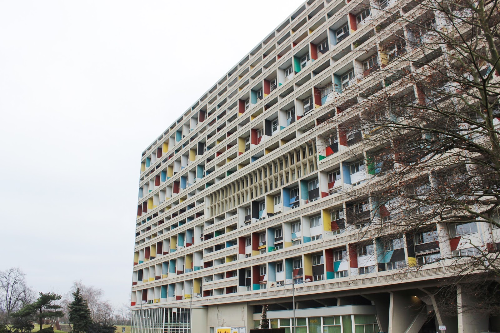
Stock: The decision to use yellow paper on the cover has been made early, as this will add much more of an appealing effect if there were to be a grayscale image of a brutalist building on the front. Looking through the G.F Smith sampler, the closest match to the Corbusier was Citrine or Factory Yellow from the Colourplan collection, this would be in a 270GSM weight to add substance to the cover;


It was tempting to add an emboss that would resemble concrete, however upon a bit more thought it completely goes against the term 'form follows function', and as the emboss wouldn't actually add anything to the books function it was left out.

internal pages would be consistent, semi-bleached white stock around the 180GSM mark to give the book some bulkiness and impact, but also a sense of quality.

Type: As mentioned  the typographic elements need to resemble that of a Modernist tendency, thus Swisse Int'l seemed fitting. Also, this typeface is based off an old Grotesk, one of the first types of Sans Serif typefaces around. This helps solidify the synthesis between old Modernism and new Modernism;


And for the display face, Le Corbusier by LineTo, the obvious reason being it was inspired by the man himself;


The above screenshot also features the name of the book, this is inspired by Le Corbusier's term, 'Béton Brut' and also by incorporating the aptly spelt 'Typographie' for consistency.

Binding: This is something personally considered as one of the most important aspects of the book. Final choice being that the stitch should be exposed as this would resemble rawness in the form of a publication, reflecting that of the rawness of concrete.

This led to the Coptic stitch, being able to draw from past experience and create something more solid with less imperfections was also a nice bonus;


Monday, 26 December 2016

Publication — Visual Research — OUGD601

Context: Strongly inspired by Experimental Jetset, harbouring many Modernist tendencies however with an updated twist, representing that of the influences that the Modernist movement to date.


Publication — Colour Scheme — OUGD601

As Brutalism is quite crude and grey, using colours from the images captured of Le Corbusier's Unité building will help brighten the book up;


The image was slightly oversaturated to gain the true colours to spot, this was because lighting conditions were poor at the time.

Additional Practical Outcome — OUGD601

To further synthesise the dissertation and the relationships of utopianism in Brutalist architecture and Modernist graphic design, creating a book that explains the journey through which the concrete alphabet was achieved will help assist those who are viewing the structures.

This also allows the opportunity to showcase how Modernist graphic design has matured over the years following all of the refinements and changes it has gone through. This will be executed through editorial and typographic form throughout the publication supporting the concrete objects. The heavy influence by Thomas More's utopian alphabet, Le Corbusier's Unité d'Habitation, and most importantly of all, the completed dissertation with all sources will essentially create a guide of which to view the letters. Quintessentially describing the project from start to finish from a theoretical point of view.

This book will be executed with obvious connotations to the work of Experimental Jetset, that could be considered as a 'modern' Modernist attitude towards the movement compared to 40/50 years ago. Using elements like a sans serif based typefaces and a strong use of the grid system.

Saturday, 24 December 2016

Primary Research — Unité d'Habitation — OUGD601

To better inform the concrete letters, a visit to one of the most influential and greatest pieces of Brutalist architecture seemed fitting. Unité d'Habitation by Charles-Édouard Jeanneret, otherwise known as Le Corbusier.

This building, located Charlottenburg-Wilmersdorf, Berlin, Germany is known as 'Corbusierhaus' locally. It is one of four other Unité buildings due its sheer success, the rest of which are located in France, the original in Marseille, in southern France;


Creating a personal photographic journal (22nd Dec 2016) of this building will assist in creating concrete letters that potentially follow similar ideological guidelines as these buildings. As Le Corbusier is widely known as the 'Father of Brutalism', it was logical to utilise the true meanings of the concrete and incorporate into the letters, thus further emphasising the utopian aspect of the project.

Images:


Study of its 'Modulor' façade the Corbusier profusely used throughout his designs:


'Modulor Man' — Le Corbusier's unit of measurement based off the divine proportion. It is also used throughout the building, and every other building designed by him. This was used to avoid converting imperial into the metric system, but it was also to create a more natural space of which to live in, adapting the dimensions of his buildings to those of the average hight of an adult:


Interior shots of the lobby:


Texture feature on a selection of the walls:


In summer the building surrounded by greenery and life:


View of Corbusierhaus from top of abandoned US Cold War spy station


All of the above images were taken using a Canon EOS 600D, and then processed through Adobe Lightroom using VSCO to create the effect that the images were taken using a film camera more specific to the time, as the effect the Kodak film gives above.

It is no wonder this is such a sought after place to live, and also explains why many architects of this time wanted to create their rendition of a movement that was so prevalent for a good part of the 20th century. Nearly all of the residence that were coming in or out of the building greeted you with a friendly 'Hallo' or 'Guten Morgen'. This was refreshing as Le Corbusier's original designs set out to do just this, for everybody, no matter their background or class, to live under one roof and socialise, what one may consider a Utopian ideal (Similar to that of Thomas More's Utopian Island).